About:
The Ressoar Institute is a non-governmental social responsibility organization created by the Record group to work in culture, education, citizenship, and professional development, promoting projects that connect volunteer work, inclusion, and opportunities for communities in various regions of Brazil. The website is accessed not only by the beneficiaries of the project, but also by companies and investors interested in participating in the programs through donations, incentives, and sponsorships.
This project was developed under a very tight deadline and with a very clear directive: simplicity. The institute requested a straightforward experience, avoiding complex animations, transitions, parallax effects, or decorative interactions. The focus was on clarity and structure: organizing information, numbers, statistics, text, and imagery in a modular, almost template-like system that could communicate quickly and clearly.
This is another project that stands out from other products within the Record Group ecosystem, as it has its own visual identity and addresses goals that differ significantly from the other R7 websites. Ressoar also holds a special place among the work I’ve done throughout my career, as it is a social institute dedicated to supporting people through donations and services.
My first contact with the institute happened in 2018, when I was part of the art direction team responsible for producing a photo shoot for their website. Understanding the social purpose behind the initiative and working alongside dedicated, well-intentioned people was a meaningful experience. Years later, I led the complete redesign of the institute’s website, aiming to increase visibility and improve the experience for everyone who accesses it, both program beneficiaries and potential donors and sponsors, positively impacting thousands of lives.
From the first sections of the institute’s homepage, visitors can learn how the institute operates and how its different areas of activity are structured. Immediately after, another section presents key figures and impact metrics through infographic elements, highlighting both the results of the programs and how resources are allocated across campaigns.
Commitment and transparency are the pillars of the institute's communication, combined with the care and dedication applied to each of its programs.
Within the “About Us” section, users can learn about the institute’s history and explore a timeline highlighting key milestones in its development.
The website includes donation forms that support multiple payment methods, including recurring options, making it easier to contribute to the institute’s programs. Additional forms are available throughout the site, allowing individuals and organizations to easily get in touch, whether they wish to become beneficiaries, donors, or campaign sponsors.
Special attention was given to these forms, as they play a critical role in sustaining the institute. A careful balance was needed between collecting essential information and avoiding an overloaded registration flow that could discourage completion.
Donation and sponsorship flows are often perceived as tedious, as they require details that users may not have immediately available, such as payment information or documents. For this reason, and given the importance of these interactions to the institute’s operations, the experience was designed to be as clear, intuitive, and streamlined as possible.
When I was tasked with redesigning the Instituto Ressoar website, its visual identity had recently been updated. The goal was to give the program a refreshed digital presence, increasing its reach and visibility.
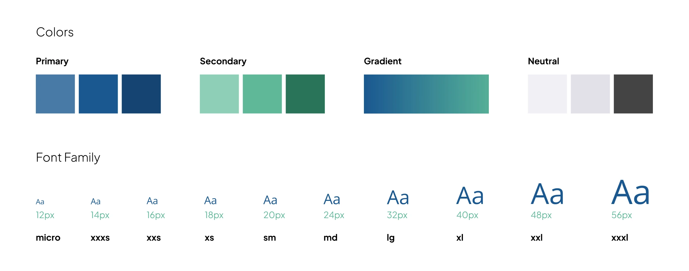
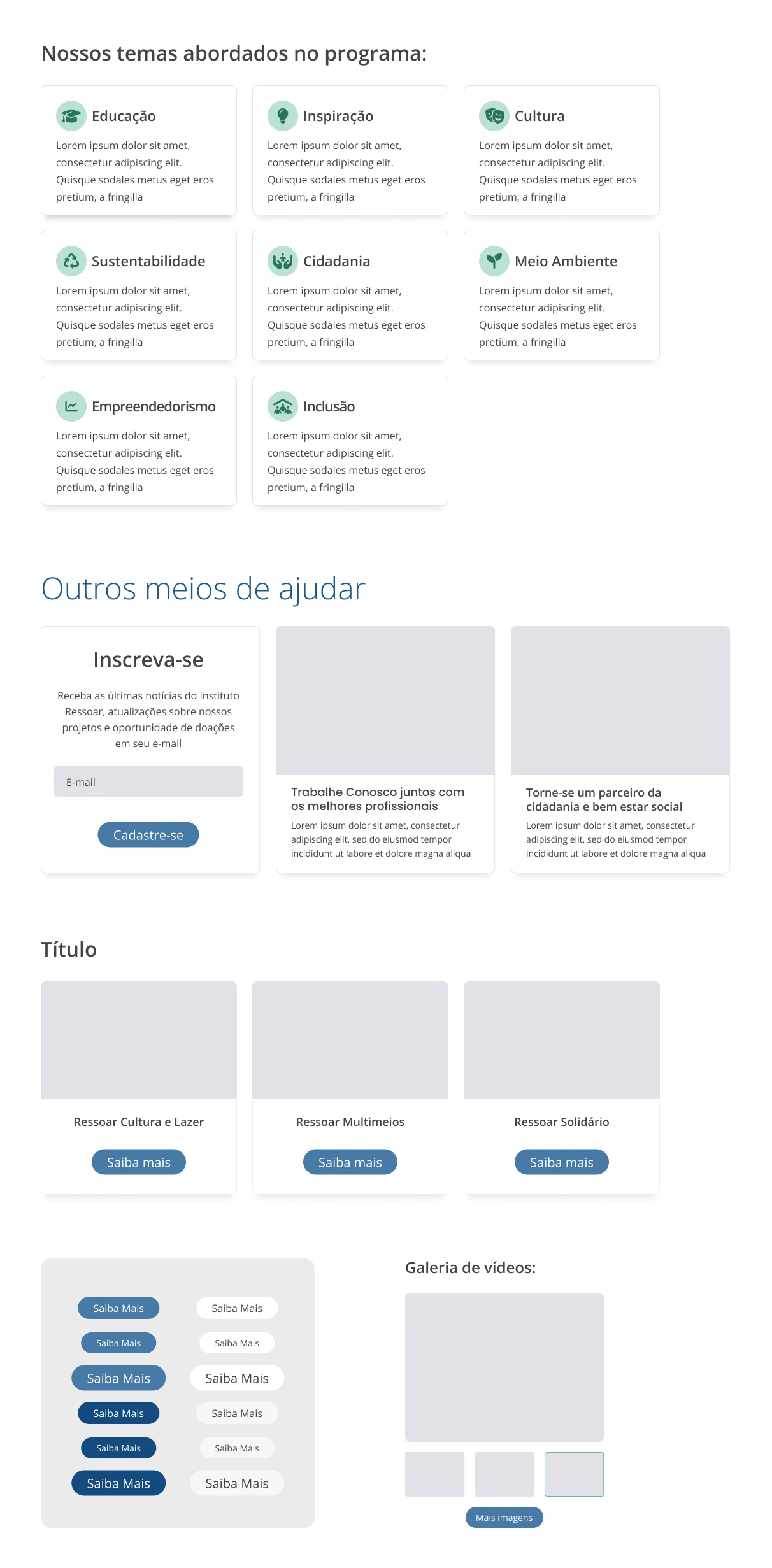
As a product very different from the rest of the Record Group ecosystem, the project required a dedicated design system rather than a direct application of the existing R7 standards. While some elements are shared with other websites in the group due to overlapping communication objectives, most components were rethought and redesigned to better support the institute’s specific needs.
Using the visual identity manual as a starting point, elements such as colors, gradients, shapes, icons, and core functionalities were developed from scratch, coming together in a harmonious system designed to feel welcoming and to convey care and warmth to users.
The biggest challenge of this project, beyond the tight timeline to launch the brand update alongside a new design system, was creating interfaces that could speak effectively to two very different audiences: program beneficiaries and potential donors or sponsors.
Although the institute requested a very simple, content-driven website, free from complex interactions or visual effects, this request only added to the challenge. Every layout, word, and statistic needed to communicate value, trust, and impact with clarity and purpose.
In addition to finding a visual and verbal language that resonated with both groups, the communication needed to convey credibility and trust, while still reflecting the care and empathy present in the institute’s initiatives.
At this stage, direct dialogue with both audiences made a significant difference. Listening to their needs and perspectives helped identify common ground, allowing the content to come together in a clear, efficient, and welcoming design.


